The colors

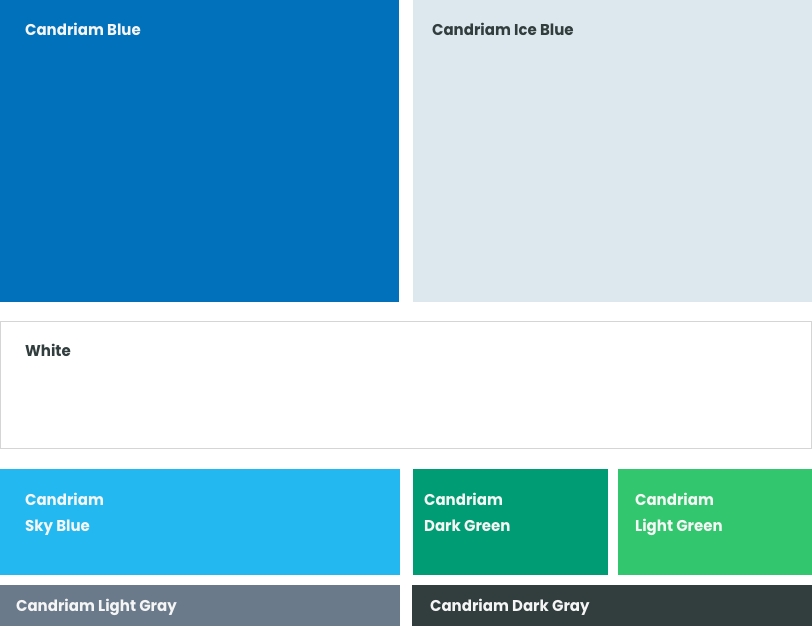
Primary color palette

This is the primary palette of our brand.
It’s reassuring, calm, pure and serious. Ideal for our sector.

Candriam Blue

  • cymk 100 / 44 / 0 / 0
  • rgb 0 113 186
  • Hex #0071BA
  • Pantone 660 C

Candriam Ice Blue

  • cymk 16 / 5 / 4 / 0
  • rgb 221 232 238
  • Hex #DDE8EE
  • Pantone 656 C

Candriam Sky Blue

  • cymk 68 / 7 / 0 / 0
  • rgb 36 184 241
  • Hex #24B8F1
  • Pantone 298 C

White

  • cymk 0 / 0 / 0 / 0
  • rgb 55 255 255
  • Hex #FFFFFF

Candriam Dark Green

  • cymk 97 / 8 / 73 / 1
  • rgb 0 156 115
  • Hex #009C73
  • Pantone 340 C

Candriam Light Green

  • cymk 70 / 0 / 70 / 0
  • rgb 50 198 110
  • Hex #32C66E
  • Pantone 2256 C

Candriam Dark Gray

  • cymk 75 / 60 / 60 / 50
  • rgb 50 61 62
  • Hex #323D3E
  • Pantone 447 C

Candriam Light Gray

  • cymk 30 / 17 / 8 / 51
  • rgb 106 122 138
  • Hex #6A7A8A

Color proportions for primary colors

Aim for these proportions within the design. This does not have to be followed exactly, but it ensures that the blues are dominant, while the other colours support and highlight the content.

Additionnal color palette for charts & graphs

This is a secondary color palette for charts & graphs only. These complementary colors can be used in addition to the primary colors, to add dynamism, vibrancy and contrast.

Candriam Navy Blue

  • cymk 100 / 62 / 0 / 61
  • rgb 0 38 100
  • Hex #002664

Candriam Dark Ice Blue

  • cymk 19 / 5 / 0 / 9
  • rgb 188 219 231
  • Hex #BCDBE7

Candriam Blue Gray

  • cymk 20 / 10 / 0 / 15
  • rgb 173 194 216
  • Hex #ADC2D8

Candriam Lavander Blue

  • cymk 69 / 53 / 0 / 1
  • rgb 77 118 252
  • Hex #4D76FC

Colors order

You should respect the following color order on your graphs, in order to make sure the contrast between the lines is sufficient.

For specific status & alerts

Get the full brand book in PDF Download